EVERSTELL

Redesigning an Enterprise Financial Platform for Clarity, Scale, and Speed


My Role

Team

Scope

Key Methods

Problem

Unclear onboarding process with no visual steps or progress indicators to guide users through setup

Rigid workflow navigation, preventing users from moving back to previous steps without restarting the entire process

Frequent upload errors with little guidance on how to resolve them

Dependence on IT support whenever users encountered validation issues or missing data

Repetitive document uploads, requiring users to upload files across multiple screens instead of managing them in one place

Tedious document management, often forcing users to download and re-upload files during different steps

Outdated visual design, lacking strong branding, hierarchy, and the level of trust expected from a financial platform

Poor information hierarchy, making it difficult for users to interpret data quickly

Solution

Guided onboarding flow structured into five clear steps with visible progress indicators

Flexible navigation allowing users to move forward and backward between steps without restarting the process

Centralized document management through a master file upload page

Drag-and-drop file uploads enabling users to upload multiple documents quickly

Automatic error detection allowing users to identify and correct issues without contacting IT support

Editable file management, allowing users to replace, remove, or update documents without restarting onboarding

Modern fintech visual redesign introducing stronger branding, clearer hierarchy, and improved trust

Dedicated entry points for new clients and existing members to streamline navigation within the platform

Overview

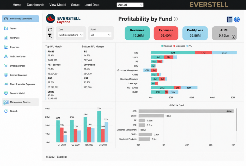
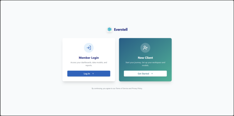
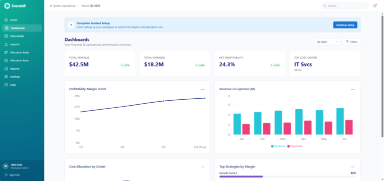
Everstell is a financial modeling platform used by enterprise finance teams to manage allocations across entities, cost centers, and funds. The platform supports organizations managing $100B+ in assets under management (AUM), where accuracy, reliability, and clarity are critical.

Founded by CPAs with 40+ years of combined experience, Everstell brings deep domain knowledge to complex financial workflows and reporting systems.

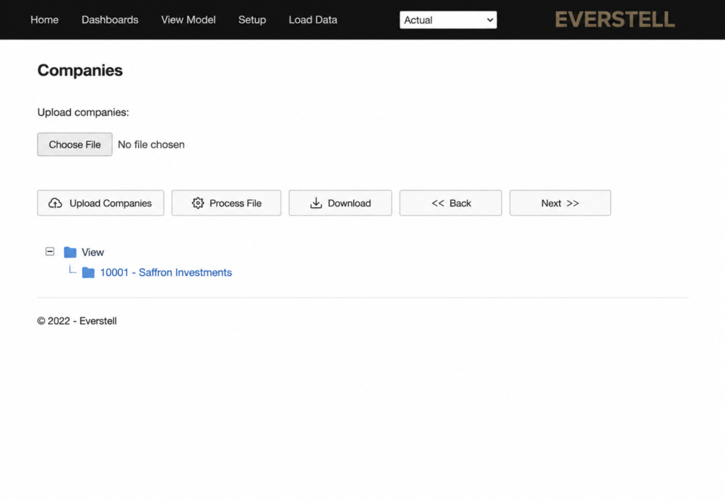
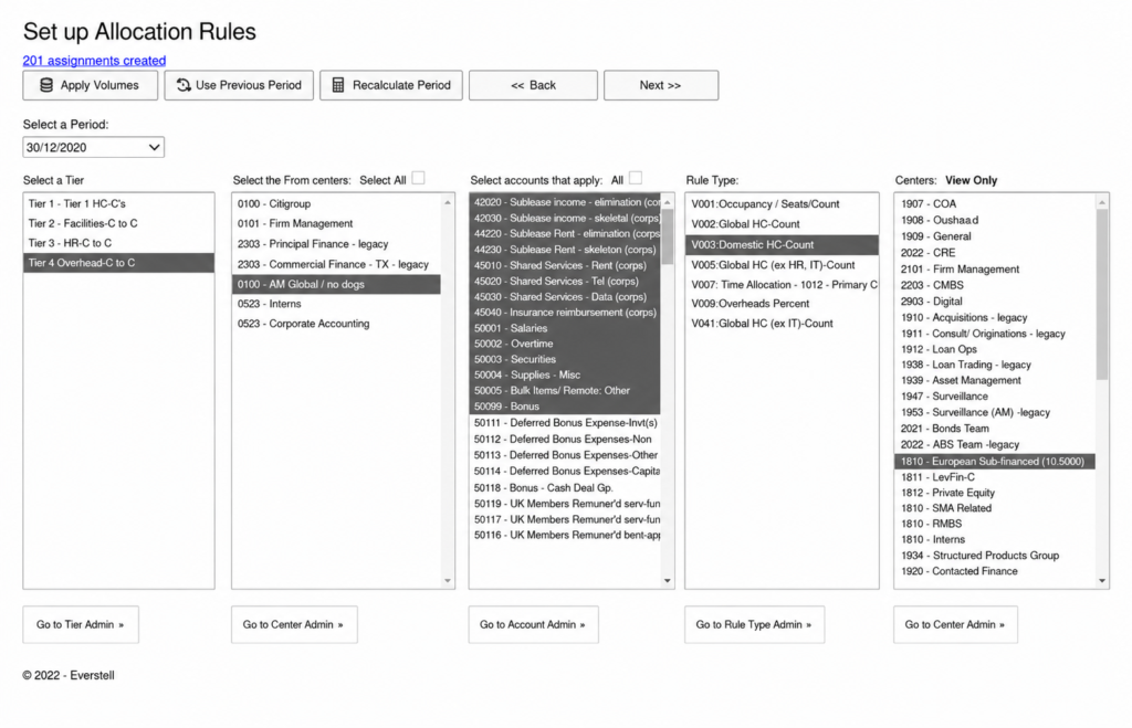
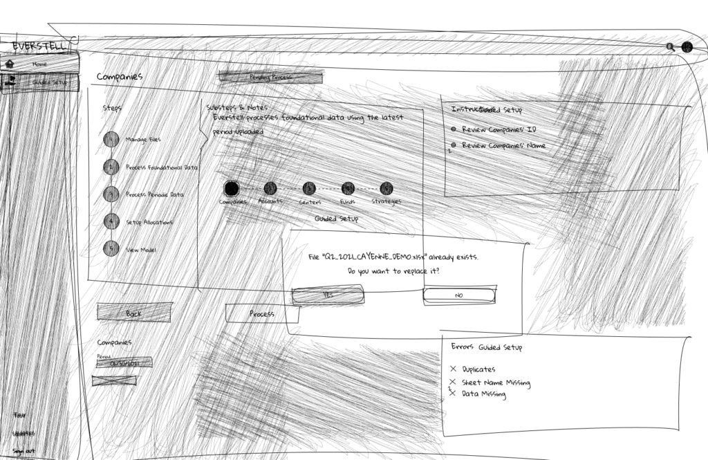
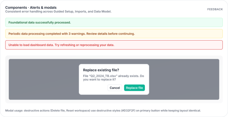
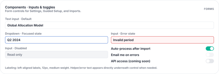
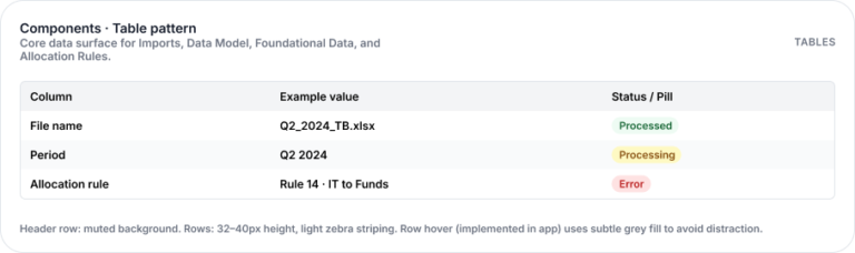
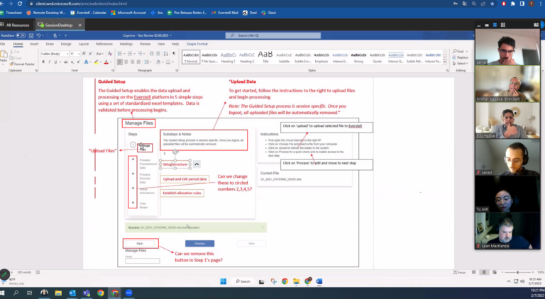
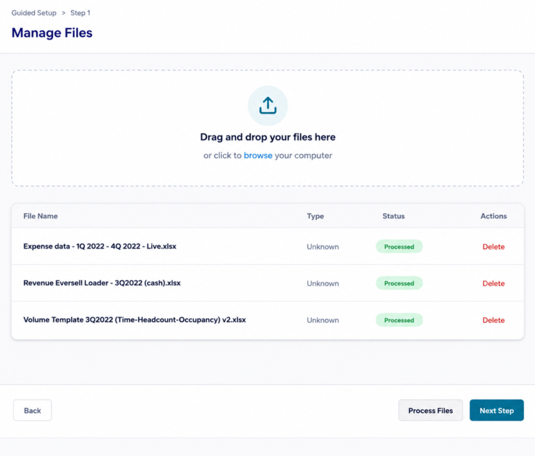
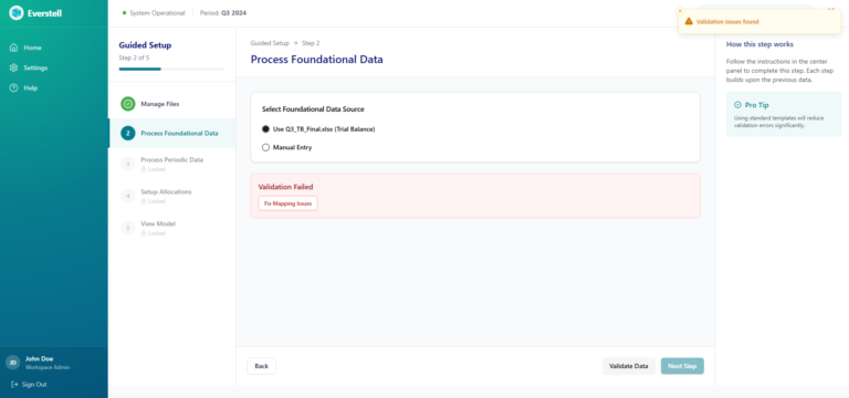
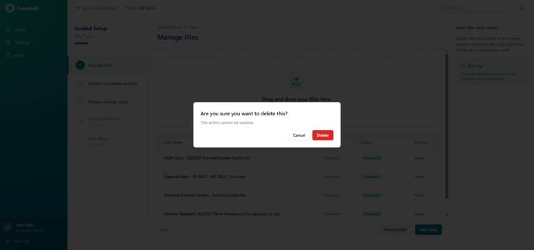
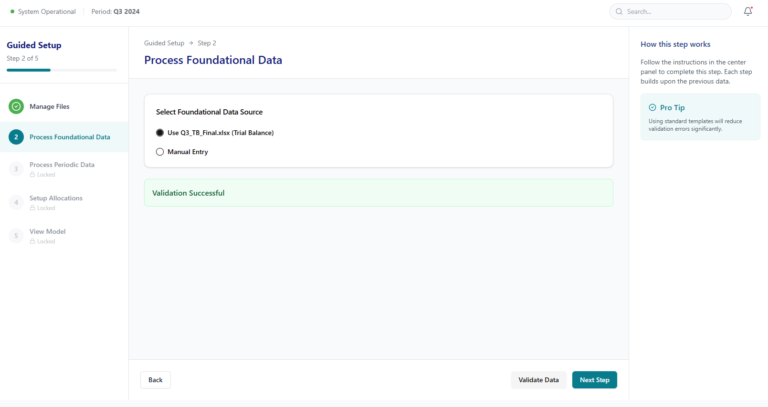
Despite the platform’s powerful capabilities, the onboarding experience created significant friction. Finance teams had to upload multiple documents, configure allocation rules, and resolve validation issues before accessing the platform’s insights.

The workflow was fragmented, repetitive, and difficult to navigate, slowing down onboarding and increasing dependency on support.

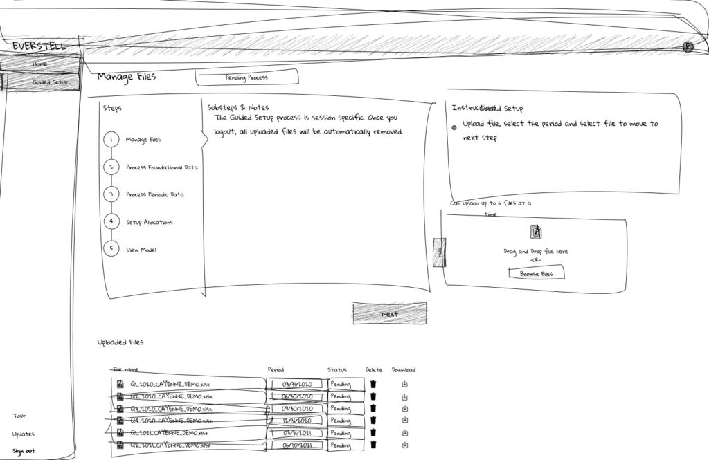
This redesign focused on transforming onboarding into a guided, structured product experience that helps finance teams complete setup faster and reach valuable financial insights with confidence.

Previous Experience

Onboarding

  • Poor visual hierarchy and inconsistent branding
  • Redundant actions (multiple “Upload” buttons for the same task)
  • No clear step structure or progress visibility
  • Confusing file flow (upload → process → download not intuitive)
  • Navigation bar inconsistent with product identity
  • Accessibility issues (low contrast, hard-to-read interface)

Dashboard

  • Visually inconsistent with onboarding experience
  • Weak information hierarchy

Cost Allocation

  • Manual selection for each item — users had to check every cost center individually, making it easy to miss entries and introduce allocation errors

  • Error-prone manual workflow — selecting cost centers one by one increased the risk of missing items and led to inaccurate allocations

  • No bulk selection — required manual checking of each cost center, making the process slow and prone to mistakes

Ramping Up Quickly

Good artists copy. Great artists steal.”
Pablo Picasso

Rather than reinventing patterns, I wanted to understand how the best enterprise platforms handle complex workflows. My goal was simple: learn from systems that already work at scale.


But How?

These SaaS niche products are not simply found with just a Google search.

Booking Demos

I joined these calls as a potential customer, observing how these platforms approached:

onboarding experiences
document management workflows
dashboard hierarchy
navigation systems
error handling and validation

Aligning with Stakeholders

Initially, there was hesitation about conducting direct user interviews. Some stakeholders were concerned that exposing the product’s weaknesses might create unnecessary friction with clients.

To address this, I reframed the interviews as an opportunity to improve the next evolution of the product, focusing on workflow efficiency and future improvements rather than criticism of the current system.

Speaking with Users

Current users: 
• CFOs

Asset Managers

Aha Moment!

The challenge was not to redesign the UI.

It was to redesign the onboarding process itself.

Realigning the Team From UI Refresh to Workflow Redesign

Because the change impacted both product direction and engineering implementation, I brought engineers into the discussion early to ensure feasibility and shared understanding.

Together we reviewed:

• Research insights and user pain points
• The proposed onboarding workflow changes
• Technical constraints and system dependencies
• Opportunities to simplify validation and document handling

Defining Success

North Star

  • Onboarding Completion Rate:

    Increase the percentage of users who successfully complete the onboarding process and reach the dashboard without abandoning the setup flow.

Key Metrics

  • Time to Complete Onboarding:

    Reduce the amount of time required for users to upload documents, configure required data, and finish the onboarding process.

  • Upload/Validation Rate:

    Lower the frequency of errors during document uploads and data validation to minimize user frustration and workflow interruptions.

  • Support Dependency Reduction:

    Decrease the number of cases where users must contact IT support to resolve onboarding issues.

  • Time to First Value:

    Reduce the time it takes for users to complete onboarding and access meaningful financial insights on the dashboard.

  • User Confidence:

    Increase users’ sense of clarity and control while completing onboarding.

Problem

  • No progress visibility → drop-offs
  • Fragmented uploads → errors
  • Rigid workflow → restarts
  • Late validation → support dependency
  • Poor hierarchy → cognitive overload

Execution & Delivery

Constraints & Considerations

  • Time constraint: Prioritized high-impact improvements that could be implemented quickly to improve activation
  • Scope limitation: Focused on onboarding and early product experience rather than a full platform redesign
  • Engineering constraints: Solutions aligned with existing backend validation logic and system architecture
  • Resource constraints: Limited engineering bandwidth required focusing on scalable, reusable solutions
  • Prioritization strategy: Identified and executed on highest-leverage opportunities (low effort, high impact) to drive immediate improvements

Collaboration & Team Workflow

  • Weekly Team Syncs:

    Two weekly Zoom meetings with the full team ensured alignment on product direction, design progress, and development priorities.

  • Daily Check-Ins:

    Short daily touchpoints with developers helped address technical questions quickly and maintain momentum during implementation.

  • Stakeholder Alignment:

    Regular one-on-one meetings ensured UX decisions remained aligned with product and business goals.

  • Design Collaboration:

    Close collaboration with other designers helped refine interaction patterns and maintain consistency across the product.

Sketching & Early Exploration

  • Drag-and-drop uplaod concept:

    Replaced multi-step upload actions with a single interaction to reduce friction and enable bulk uploads

  • Simplified upload flow:

    Removed redundant steps (choose file → upload → process) into a streamlined interaction

  • Breadcrumb navigation:

    Introduced step visibility to help users understand progress and navigate the onboarding flow

  • Left-side navigation structure:

    Replaced top navigation with a vertical sidebar to improve scalability, accessibility, and consistency across the platform

Collaborative Discussions

Early sketches were reviewed with stakeholders and engineers to gather feedback and assess technical feasibility.

Discussions helped refine the onboarding workflow and validate key interaction patterns.

Sketching enabled quick alignment across the team before moving into detailed wireframes.

Design System Foundation

Typography

Segoe UI was selected for its clarity and readability in data-dense enterprise interfaces.

Its clean letterforms and balanced spacing ensure financial metrics, labels, and navigation remain easy to scan across complex dashboards and onboarding flows.

The typeface also maintains strong legibility at smaller sizes, supporting tables, validation messages, and detailed financial data throughout the platform.

  • Font Type: Segoe UI
  • Font Size: Ranging from 37px to 12px
  • Font Weight: Including Bold, Medium and Light

Color System & Branding

Components Buttons

Alerts and Modals

Components Inputs and Toggles

Components Table Pattern

Background and Borders

Components Badges and Status Chips

Iterations on Mid-Fidelity Wireframes

High-Fidelity Solutions

Entry Point — New vs Returning Users

  • Segmented entry experience:

    Introduced distinct entry points for new clients and existing members to align with different user journeys.

  • Direct access for returning users:

    Existing members can bypass onboarding and access dashboards and data immediately.

Guided Onboarding Flow (Step-Based)

  • Reduced onboarding complexity (12→5 steps):

    Simplified a fragmented 12-step process into a structured 5-step flow, improving clarity and reducing cognitive load.

  • Structured step-based experience:

    Introduced clear progress indicators to guide users through setup and provide visibility into completion.

  • Centralized step-based experience:

    Created a single source of truth for document uploads, enabling bulk actions (drag-and-drop, edit, delete, replace).

  • Eliminated fragmented uploads steps:

    Replaced scattered, repetitive uploads with a unified interaction. 

  • Flexible navigation & recoverability:

    Users can move between steps without restarting, reducing friction during setup.

Impact
  • Improved onboarding completion rate:

    Reducing drop-off in a previously long and unclear funnel.

  • Reduced time to complete onboarding: 

    through fewer steps and streamlined interactions

  • Lower cognitive load:

    Simplifying decision points and workflow structure

  • Faster time to first value:

    Users reach the dashboard more efficiently

  • Flexible navigation & recoverability:

    Users can move between steps without restarting, reducing friction during setup.

Validation & Error Handling

  • Real-time validation feedback:

    Introduced inline validation to detect errors immediately during document upload and data configuration.

  • Actionable error messaging:

    Replaced vague system errors with clear, specific guidance to help users resolve issues quickly.

  • In-context error resolution:

    Users can fix issues directly within the flow without restarting or leaving the onboarding process.

  • Visible system states:

    Defined clear success, warning, and error states to improve feedback and reduce uncertainty.

Impact
  • Reduced dependency on IT support:

    Enabling users to resolve issues independently

  • Lower validation error rate:

    Through clearer guidance and feedback

  • Improved user confidence

Dashboard Experience

  • Immediate financial visibility:

    Key metrics such as revenue, expenses, and profitability are surfaced upfront, allowing users to quickly assess financial performance.

  • Scannable data hierarchy:

    Structured layout and typographic hierarchy enable users to interpret complex financial data at a glance.

  • Visualized trends and insights:

    Charts and graphs provide clear visibility into financial trends over time, supporting faster analysis and decision-making.

  • System status and health indicators:

    Status signals communicate the state of models and data processing, reducing uncertainty.

Impact
  • Reduced dependency on IT support:

    Enabling users to resolve issues independently

  • Lower validation error rate:

    Through clearer guidance and feedback

  • Improved user confidence

High-Fidelity Solutions

Ticket Mapping & Delivery Planning

  • Jira alignment:

    Mapped designs to implementation tickets (e.g., onboarding shell, file management, validation, dashboard).

  • Incremental delivery:

    Broke down features into buildable phases to support parallel development and faster iteration.

Design Specification & Dev Mode

  • Figma Dev Mode specs:

    Provided spacing, typography, color tokens, and component dimensions directly in Figma for accurate implementation.

  • Clear file organization:

    Structured flows by feature (Onboarding, File Management, Dashboard) with final screens and linked components.

Component & State Definition

  • Reusable components:

    Delivered a component library (buttons, inputs, upload modules, KPI cards) to ensure consistency in build.

  • Defined interaction states:

    Specified states for all key elements (default, hover, active, disabled, loading, error) to remove ambiguity.

Interaction & Logic Documentation

  • Flow annotations:

    Documented key behaviors for onboarding steps, file uploads, and navigation.

  • Validation logic:

    Defined rules for errors, success states, and edge cases (e.g., duplicate files, invalid formats, missing data).

Engineering Collaboration

  • Handoff walkthroughs:

    Ran sessions with engineers to review flows, clarify interactions, and align on constraints.

  • Design–engineering alignment:

    Adapted patterns to fit frontend architecture (e.g., navigation structure, component reuse) to reduce complexity.

QA & Iteration During Build

  • Design QA:

    Reviewed staging builds to ensure visual and interaction accuracy.

  • Continuous feedback loop:

    Addressed implementation questions, refined details, and adjusted designs based on real constraints.

This approach ensured the designed experience translated accurately into a scalable, maintainable product.

Final Shipped Product

Impact

  • Onboarding completion rate ↑ 30–40%:

    Simplifying the flow from 12 steps to a structured 5-step process significantly reduced drop-off across the onboarding funnel.

  • Time to complete onboarding ↓ ~35%:

    Streamlined interactions, bulk uploads, and reduced redundancy enabled faster setup and quicker access to the platform.

  • Validation and upload errors ↓ ~30%:

    Improved feedback systems and centralized file management reduced user mistakes in high-stakes financial workflows.

  • Time to first value ↓ ~35%:

    Users were able to reach dashboards and actionable financial insights faster after completing onboarding.

  • User confidence ↑:

    Clear step progression, better feedback, and improved system visibility increased trust and usability during setup.

  • Support dependency ↓ significantly:

    Clear validation and in-context guidance allowed users to resolve issues independently, reducing reliance on IT support.

  • Post-onboarding engagement ↑ ~40%:

    Improved dashboard clarity and data visualization encouraged deeper interaction with financial insights.

The redesign shifted onboarding from a technical bottleneck into a scalable product experience that enables finance teams to move from setup to insight with speed and confidence.

Reflection

This project reinforced that in enterprise products, the biggest challenges are rarely visual—they are structural.

By focusing on workflow clarity, system feedback, and user control, complex financial processes became significantly more manageable.

The key takeaway:

When systems guide users step-by-step, complexity becomes intuitive.

Next Steps

  • Advanced filtering and bulk allocation tools
  • AI-assisted validation and anomaly detection
  • Customizable dashboards and reporting
  • Continued usability testing and iteration