Leop’s existing dashboard lacked visual appeal and had a complex, non-intuitive navigation system. The light mode interface caused eye strain for users working long hours. Users found it difficult to interpret data quickly and efficiently, leading to lower engagement and productivity.
Solution
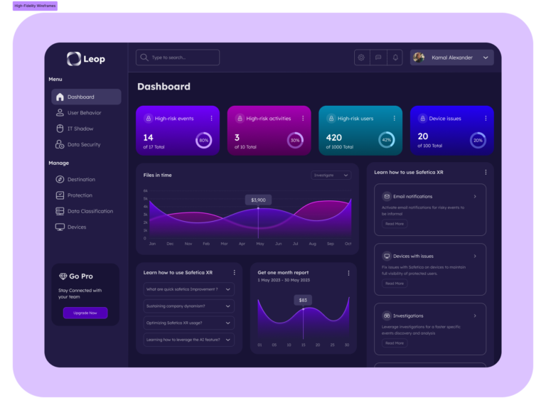
We developed a robust design system to ensure visual consistency and efficiency, with a specific focus on dark mode to reduce eye strain and improve readability. Utilizing Figma, we created a comprehensive library of reusable components, integrated auto layout features, and standardized design elements like fonts, icons, and spacing. The goal was to create a visually appealing and user-friendly dark mode dashboard that simplifies data interpretation and enhances user engagement.
Revamp the user interface and enhance the overall user experience of Leap’s data dashboard with a focus on dark mode. The redesign aims to improve data visualization, streamline navigation, and ensure a cohesive and engaging user experience.
Key Metrics
User Engagement: Track the frequency and duration of user interactions with the dashboard, aiming for a significant increase.
Task Completion: TMeasure the time users take to complete key tasks, with a goal to reduce this time for improved efficiency.
Error Rate: Monitor the frequency of user errors, striving to lower this rate to indicate a more intuitive design.
User Satisfaction: Collect user feedback and satisfaction ratings to gauge the overall success of the redesign.
Data Visualization: Ensure the clarity and usability of data presentations so users can easily interpret and act on the information.
Research and Comparative Analysis
To ensure our design was both modern and competitive, we conducted extensive research and a comparative analysis of current trends in UI/UX design for dashboards. Our research involved:
Competitive Analysis:
Analyzed leading IT dashboards to identify best practices and innovative design solutions for dark mode interfaces.
Trend Analysis:
Focused on modern UI/UX trends such as minimalist design, dark mode, and micro-interactions to create a contemporary look and feel.
User Preferences:
Gathered user preferences through surveys and feedback, focusing on preferred design elements and features for dark mode interfaces.
Design System
Established a design system that included:
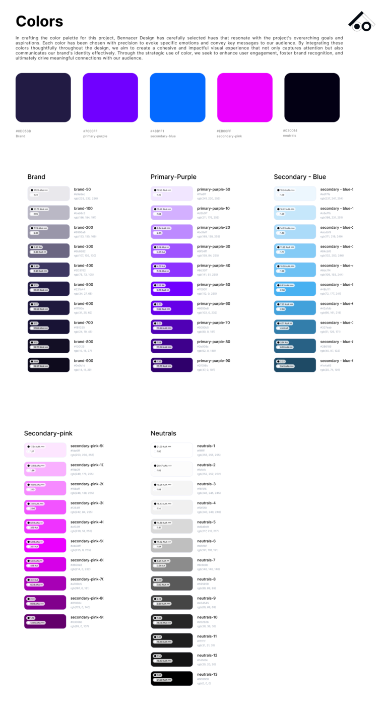
Color Theory
A carefully selected palette to match the brand and smooth on dark mode.
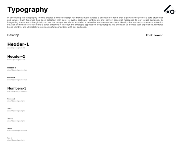
Fonts and Typography
Font Type: Lexend
Font Size: Ranging from 37px to 12px
Font Weight: Including Bold, Medium and Light
Auto Layout
Enabled dynamic resizing of components, ensuring that elements adapted smoothly to different sizes and states.
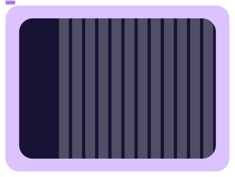
Layout Grid:
Count: 13
Width: 72
Offset: 292
Gutter: 24
Spacing
Standardized spacing units (8px, 16px, 24px) to create a harmonious and balanced design.
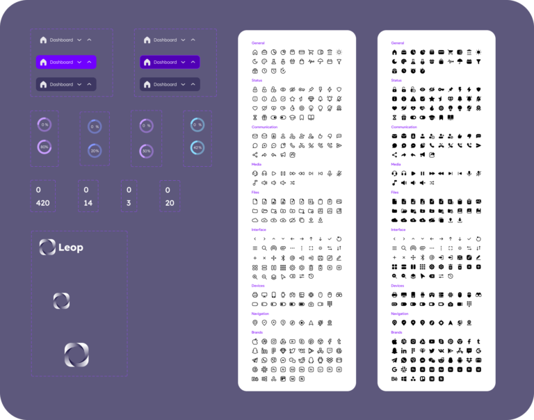
Library Components
Designed a comprehensive library of reusable components, ensuring consistency and ease of maintenance. Key components included:
Icons:
A consistent icons’ set was used to match the overall aesthetic, improving clarity and user understanding.
Buttons and Inputs:
Standardized buttons and input fields with defined states (default, hover, active) using Figma’s variants.
Dashboard Cards:
Customizable cards for displaying key performance indicators (KPIs), featuring auto layout to adapt to various data types and sizes.
Logo
Customizable Logo Sizes + Label
Prototyping
Used components technique to create smooth animation and transition in my final prototypes.
Interactive Elements:
Interactive features like tooltips and hover effects were added to provide additional data insights. These features enhanced the user experience by making data exploration more intuitive.
Design
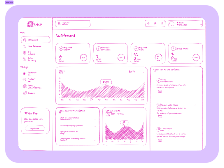
Sketching
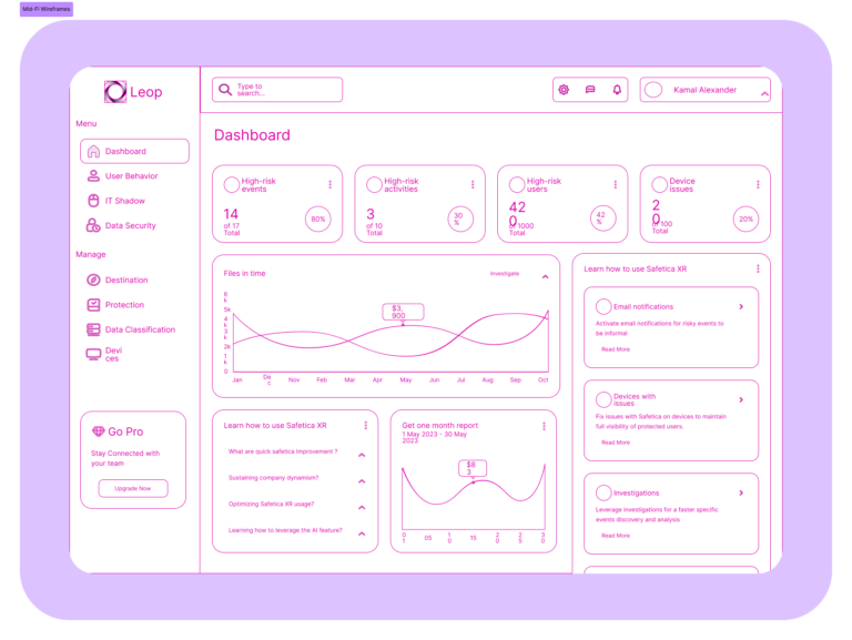
Mid-Fidelity Wireframes
High-Fidelity Wireframes
Development Collaboration
Figma Dev Mode:
Provided detailed specifications, CSS snippets, and design assets directly to the development team.
Component Annotations:
Included annotations and guidelines in Figma to clarify functionality and interactions for dark mode interfaces.
Prototypes:
Shared interactive prototypes to ensure the development team understood the intended user experience.
High-Fidelity Prototype
Impact
User Engagement: Increased by 40%,
Task Completion Time: Reduced by 35% due to improved navigation and streamlined workflows.
Error Rate: Decreased by 30% through better data visualization and clear information hierarchy.
User Satisfaction: Positive feedback indicated significant improvements in user satisfaction, with users appreciating the dark mode design’s consistency and efficiency.