To ensure smooth implementation of the design into the actual product, we leveraged Figma’s developer handoff features to assist the front-end developers and Power BI developers. This collaboration facilitated the seamless translation of the design into code using CSS, HTML, JavaScript, and Python. Key aspects included:
Koncurred
UI Redesign for AI-Driven SaaS Dashboard for Marketing Company
My Role
- UX/UI Designer
Key Methods
- Stake holders' Interviews
- User Interviews
- Comparative Competitive Analysis
- SWOT Analysis
- Persona
- Problem Statement
- New Workflows
- Usability Testing
- Hi-Fi Prototype
Problem
My project was to revamp the user interface of a SaaS dashboard for a marketing company leveraging AI. The goal was to enhance data visualization, improve navigation, and streamline the overall user experience.
Solution
We focused on creating a robust design system that ensured consistency and efficiency across the dashboard. Utilizing Figma, we built a comprehensive library of components, integrated auto layout features, and standardized design elements such as fonts, icons, and spacing.
Overview
The client, a leading marketing company, needed an intuitive and visually appealing dashboard to monitor and optimize their campaigns. Our redesign aimed to present complex data clearly and concisely, while providing a seamless user experience.
Key Metrics
- User Engagement: The frequency and duration of user interactions with the dashboard. Increasing engagement was a primary goal.
- Task Completion: The average time users took to complete key tasks, such as generating reports or analyzing data. Reducing this time was essential for improving efficiency.
- Error Rate: The frequency of user errors when interacting with the dashboard. Lowering this rate would indicate a more intuitive design.
- User Satisfaction: User feedback and satisfaction ratings, which would help us gauge the overall success of the redesign.
- Data Visualization: The clarity and usefulness of data presentations, ensuring users could easily interpret and act on the information.
Research and Comparative Analysis
To ensure our design was both modern and competitive, we conducted extensive research and a comparative analysis of current trends in UI/UX design for dashboards. Our research involved:
Competitive Analysis:
Examined leading SaaS dashboards in the market, such as those from Salesforce, HubSpot, and Google Analytics, to identify best practices and innovative design solutions.
Trend Analysis:
Identified key trends in UI design, including minimalist design, dark mode, micro-interactions, and the use of neumorphism to create depth.
User Preferences:
Analyzed user preferences through reviews and feedback on popular design elements and features.
Design System
We established a design system that included:
Color Theory
A carefully selected palette to enhance readability and highlight critical data points.
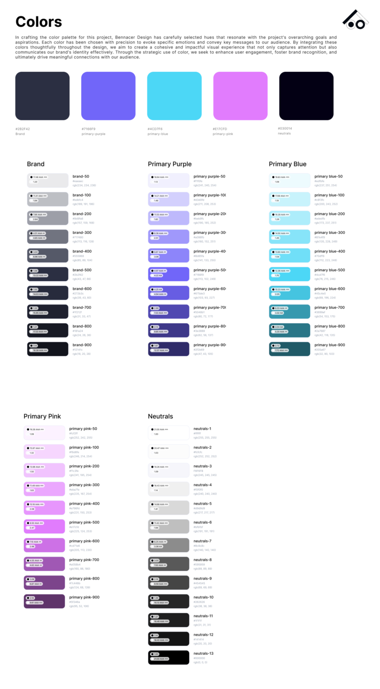
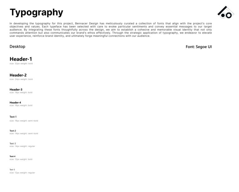
Fonts and Typography
- Font Type: Segoe UI.
- Font Size: Ranging from 32px to 12px
- Font Weight: Including Bold, Semi-Bold, and Regular
Auto Layout
Enabled dynamic resizing of components, ensuring that elements adapted smoothly to different sizes and states.
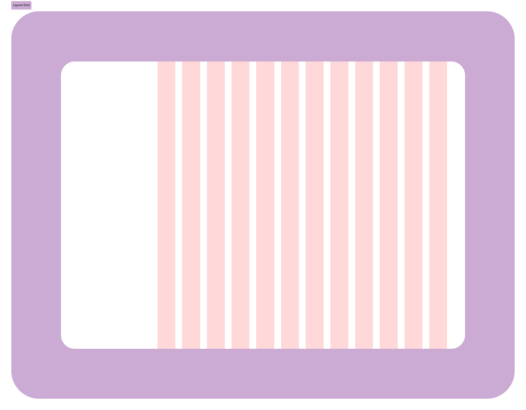
Layout Grid:
Applied the classic layout using the Desktop Frame:
- Count: 12
- Width: 64
- Offset: 344
- Gutter: 24
Spacing
Standardized spacing units (8px, 16px, 24px) to create a harmonious and balanced design.
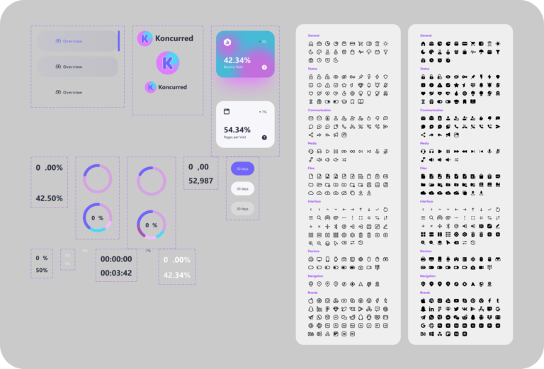
Library Components
Designed a comprehensive library of reusable components, ensuring consistency and ease of maintenance. Key components included:
Icons:
A consistent icons’ set was used to match the overall aesthetic, improving clarity and user understanding.
Buttons and Inputs:
Standardized buttons and input fields with defined states (default, hover, active) using Figma’s variants.
Dashboard Cards:
Customizable cards for displaying key performance indicators (KPIs), featuring auto layout to adapt to various data types and sizes.
Logo
Customizable Logo Sizes + Label
Prototyping
Used components technique to create smooth animation and transition in my final prototypes.
Interactive Elements:
Interactive features like tooltips and hover effects were added to provide additional data insights. These features enhanced the user experience by making data exploration more intuitive.
Design
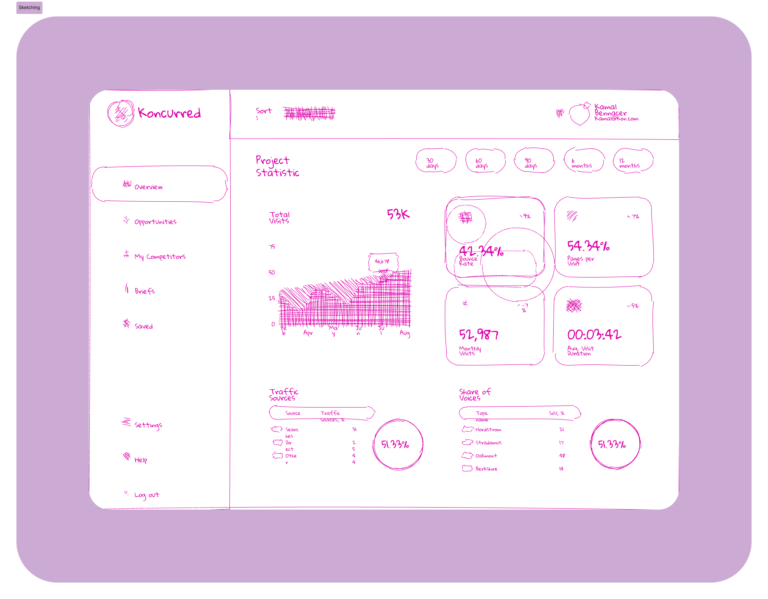
Sketching
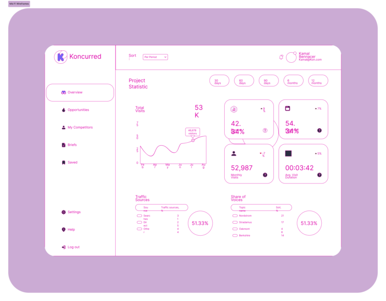
Mid-Fidelity Wireframes
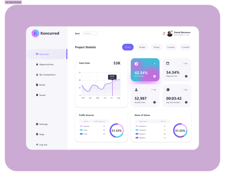
High-Fidelity Wireframes
Development Collaboration
Figma Dev Mode:
Provided detailed specifications, CSS snippets, and design assets directly to the development team.
Component Annotations:
Included annotations and guidelines in Figma to clarify functionality and interactions for the developers.
Prototypes:
Interactive prototypes in Figma were used to demonstrate user flows and interactions, ensuring the development team understood the intended user experience
High-Fidelity Prototype
Impact
- User Engagement: Increased by 35% post-implementation, as users found the new interface more intuitive and visually appealing.
- Task Completion Time: Reduced by 40% due to improved navigation and streamlined workflows.
- Error Rate: Decreased by 25% through better data visualization and clear information hierarchy.
- User Satisfaction: Feedback indicated a significant improvement in user satisfaction, with users appreciating the new design's consistency and efficiency.
Next Steps
- Enhance Other Workflows: Continue refining additional workflows such as campaign management and reporting to ensure a comprehensive and efficient user experience.
- UI Improvements: Focus on further enhancing the UI to boost user engagement and satisfaction, including adding more interactive elements and advanced data visualization options.
- Feature Expansion: Introduce new features like customizable dashboards and advanced filtering options to meet evolving user needs.
- Performance Optimization: Work on optimizing the performance of the dashboard to ensure quick load times and smooth interactions, particularly for data-heavy sections.
- Ongoing Usability Testing: Conduct regular usability testing to gather feedback and identify areas for continuous improvement, ensuring the dashboard remains user-centric and effective.