We created a user flow that brought recipes to Fran, our primary persona, based on what she wanted and needed, instead of expecting her to know what recipes to look for before using the Imperfect Foods app.
Imperfect Foods
Designing a new feature for an existing mobile app.
My Role (Team of 3)
- UX Researcher
- Project Manager
- UI Designer
Deliverables
- 2 Persona
- New Workflow
- New feature for the App
- Iterations on Design
Key Methods
- User Interviews
- Problem Statement
- Workflows Development
- Low-Fi Wireframes
- Usability Testing
- Hi-Fi Prototype
Problem
Every week, Imperfect Foods delivers groceries that would otherwise go to waste because they are excess or flawed items from farms and businesses. However, this goal of saving food from being wasted does not extend to the customer’s kitchen where 54 billion pounds of food are thrown away every year.
Solution
To help customers make the most of their imperfect foods and prevent food waste at home, we designed a new feature for the Imperfect Foods mobile app that suggests recipes based on the ingredients they choose and helps them plan their meals as they shop for groceries.
Overview
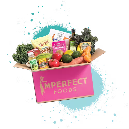
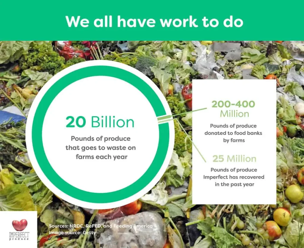
Imperfect Foods is a weekly grocery delivery service with a vision to “create a more compassionate, less wasteful world.” They save fruits and vegetables that are deemed too large, small, or misshapen for conventional grocery store shelves…as well as excess products that would otherwise end up in a landfill. Their work helps to reduce the 20 billion pounds of produce that are wasted on farms every year.
Key Metrics
- An American household of four discards over $1800 worth of food every year.
- 43% of all food waste happens in homes.
Research
We started by listening to the users directly. We recruited 9 people for our user interviews , who either used the Imperfect Foods App before or depended on a comparable grocery delivery service.
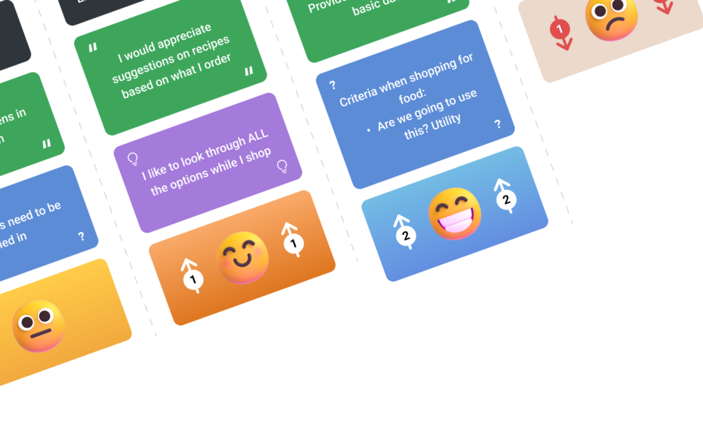
By using the affinity mapping technique, we discovered these patterns in how users shop for groceries.
Key Takeaway
Users frequently end up buying more or less produce than they need for a week’s worth of meals.
Synthesis
Our assumption that people did not plan their meals before shopping for groceries, and thus often wasted or disposed of the excess food by the week’s end, was confirmed by our research.
Before we could formulate problem statements, we created two proto-personas.
Problem Statement
Fran needs personalized recipe suggestions and guidance while grocery shopping, so she can effectively use the produce she purchases and plan for the week ahead.
Design
After we settled on a user flow (for the time being), we got together to draw and discuss some possible ways to add a Suggested Recipe feature to the Imperfect Foods app.
We had to think about how this new feature could fit into the existing Information Architecture, and adopt the established branding styles and personality.
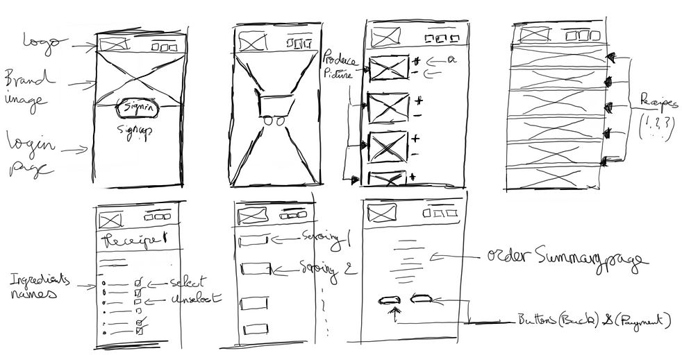
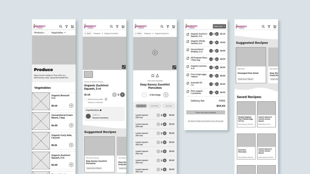
Our Low Fidelity Prototype brought our sketches to life, and allowed us to explore and test various ways of displaying recipe ingredients and saved recipes.
Solution
Imperfect Food’s suggested recipes feature helps users like Fran find recipes based on what they are buying. This saves time and avoids too many choices. We also added a serving size function to help users buy enough food for the week and reduce waste.
Iteration
We conducted Usability Testing on our Low-Fi Prototype to find out what we needed to improve for our next version…and to check that our new feature made sense for the Imperfect Foods shopper.
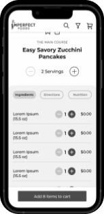
One user pointed out that with Imperfect Foods’ ever-changing inventory, it will be a challenge to continuously tweak serving sizes as the company continues to grow and scale.
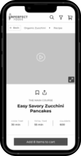
Recipe save tab icon should be purple, so it matches the “Recipe button” on the bottom navigation menu.
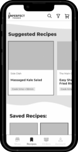
On the Saved Recipes Page, some users were distracted by the Suggested Recipe carousel and did not like having to scroll down to find Zucchini Pancakes.
High-Fidelity Prototype
We fixed the bugs mentioned above and used the existing brand identity. We wanted to make sure the new feature(s) fit well into the current Information Architecture and UI of the Imperfect Foods app.
Users liked the new Suggested Recipe feature, and especially valued the Saved Recipe page as a tool for planning their meals for the week.
Interestingly enough, Imperfect Foods launched a “Shop by Recipe” feature on their app a week after we finished this project!
Next Steps
However, we acknowledge that our prototype and testing had some limitations and there is still room for improvement. Some of the next steps we would like to take are:
- Explore other ways to personalize the recipe suggestions based on user preferences, dietary restrictions, cooking skills, and feedback ratings.
- Test the feasibility and desirability of adding other features, such as sharing recipes with friends, creating shopping lists, and tracking food waste.
- Compare and contrast our Suggested Recipe feature with the Shop by Recipe feature launched by Imperfect Foods, and identify any gaps or opportunities for enhancement.

