The objective was to redesign both the branding and the responsive landing page for “FinTech Pro,” a SaaS platform for financial management. The focus was on maximizing user engagement, enhancing brand awareness, and increasing subscriber conversion rates. This case study outlines my design process, the decisions made, and how I applied various UX/UI principles and frameworks to achieve these goals.
Key Metrics
Conversion Rate: Aim for a 20% increase in subscriber sign-ups.
Bounce Rate: Reduce to below 30% by improving the first impression.
Average Session Duration: Target 2 minutes per session to indicate user engagement.
Click-Through Rate (CTR) on CTAs: Aim for a 15% CTR on primary CTAs.
Responsive Design Performance: Ensure a seamless experience with 95% of users reporting satisfaction across devices.
AIDA Framework
The AIDA model was employed to structure the landing page content effectively:
Attention: Capturing attention with a bold value statement.
Interest: Engaging users with compelling information about the platform.
Desire: Creating a desire to subscribe by showcasing user success stories.
Attention: Prompting users to subscribe with clear CTAs.
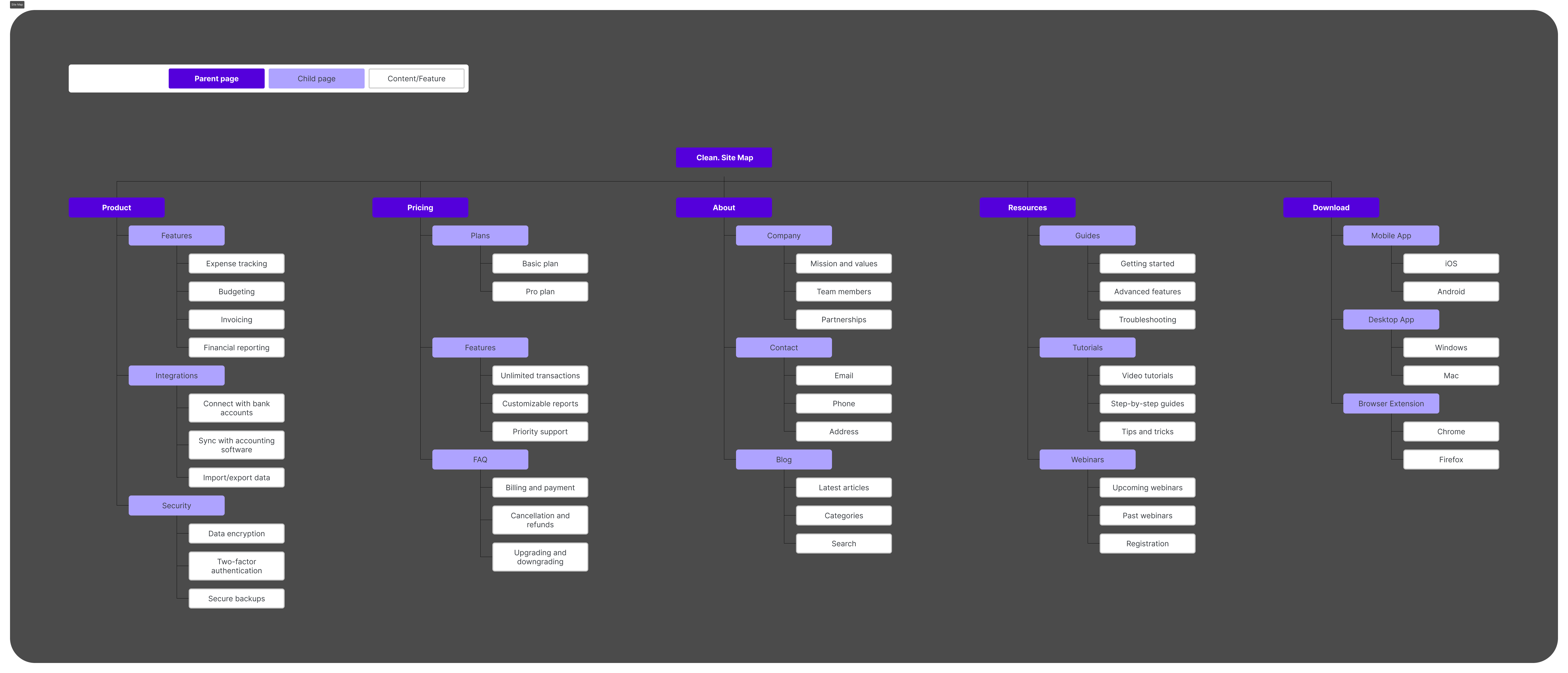
Information Architecture
Organizing Content Hierarchically: Ensuring a logical flow of information.
Prioritizing Key Sections: Following the AIDA framework.
Ensuring Seamless Navigation: Enhancing user experience.
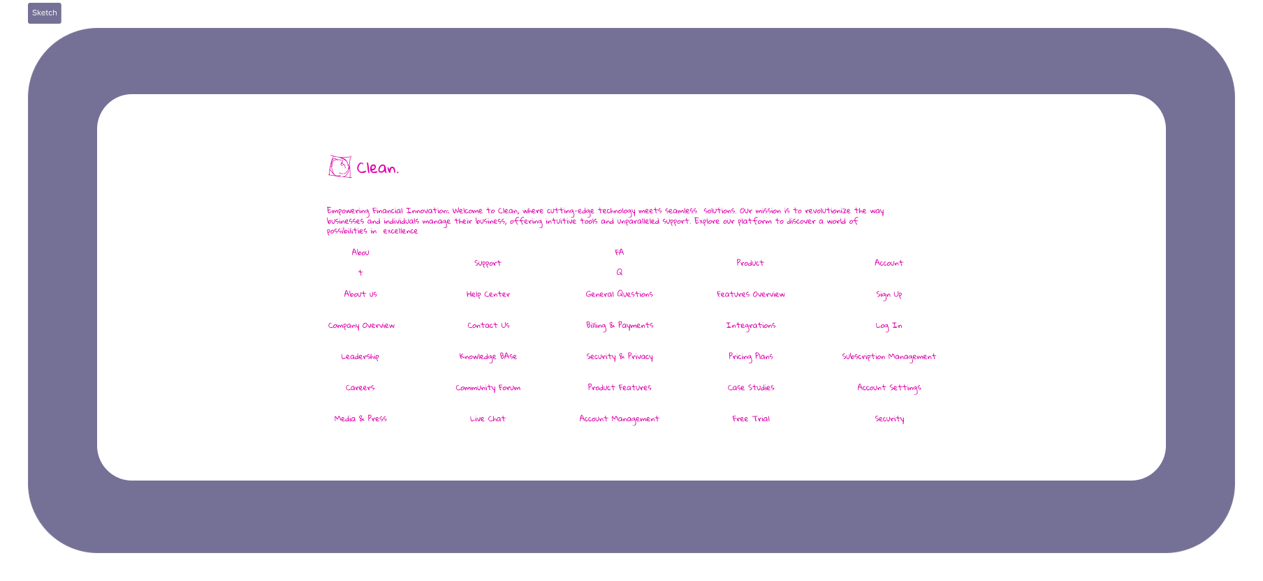
Site Map:
Design System
Trend Analysis:
Focused on modern UI/UX trends such as minimalist design, dark mode, and micro-interactions to create a contemporary look and feel.
User Preferences:
Gathered user preferences through surveys and feedback, focusing on preferred design elements and features for dark mode interfaces.
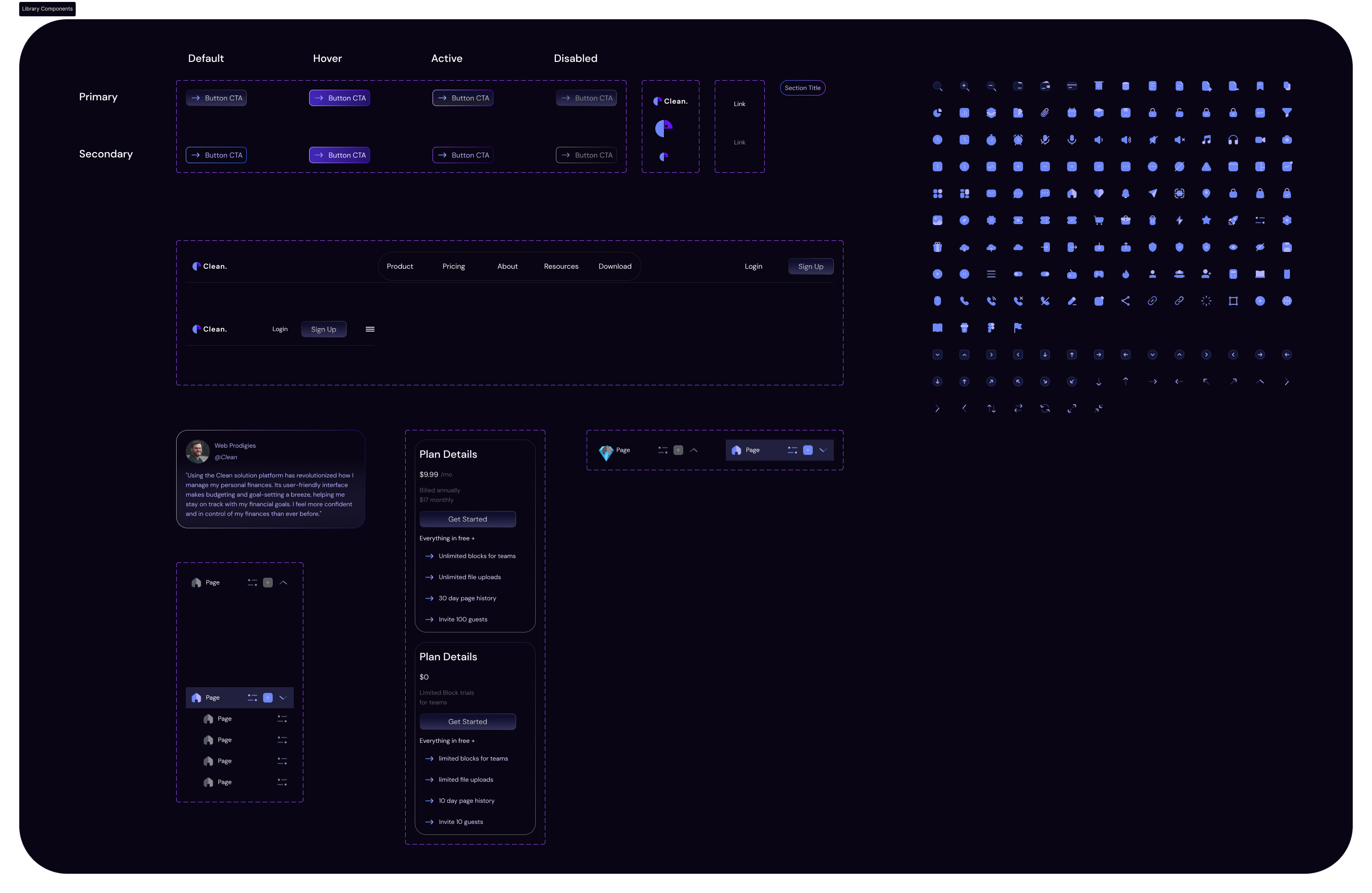
Established a design system that included:
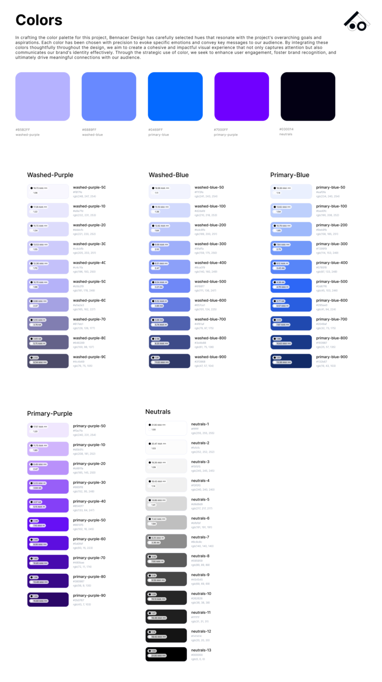
Color Theory
A carefully selected palette to match the brand and smooth on dark mode.
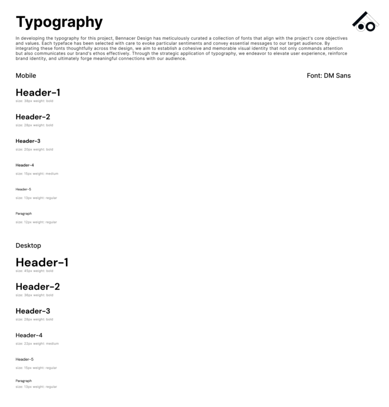
Fonts and Typography
Font Type: DM Sans
Font Size: Ranging from 38px to 13px
Font Weight: Including Bold, Medium and Light
Auto Layout
Enabled dynamic resizing of components, ensuring that elements adapted smoothly to different sizes and states.
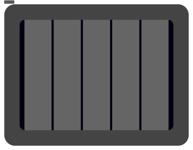
Layout Grid:
Count: 12
Margin: 45
Width: Auto
Gutter: 20
Spacing
Standardized spacing units (8px, 16px, 24px) to create a harmonious and balanced design.
Design Break Down
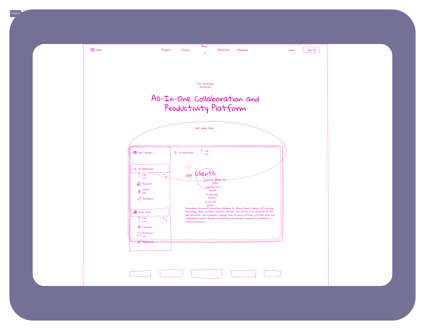
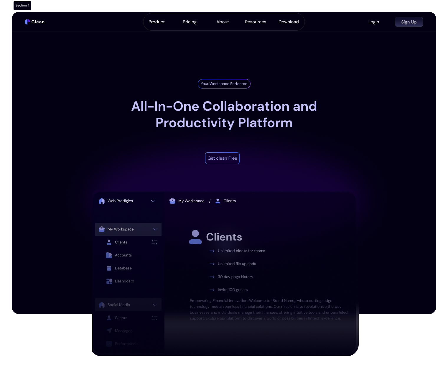
Hero Section
Objective: Capture attention with a compelling value statement and CTA.
Features: Bold headline, subheading, prominent “Get Started” button and an attractive visual glance of the product.
Visual elements: Add visual effects on the background to make the page even more attractive for visitors.
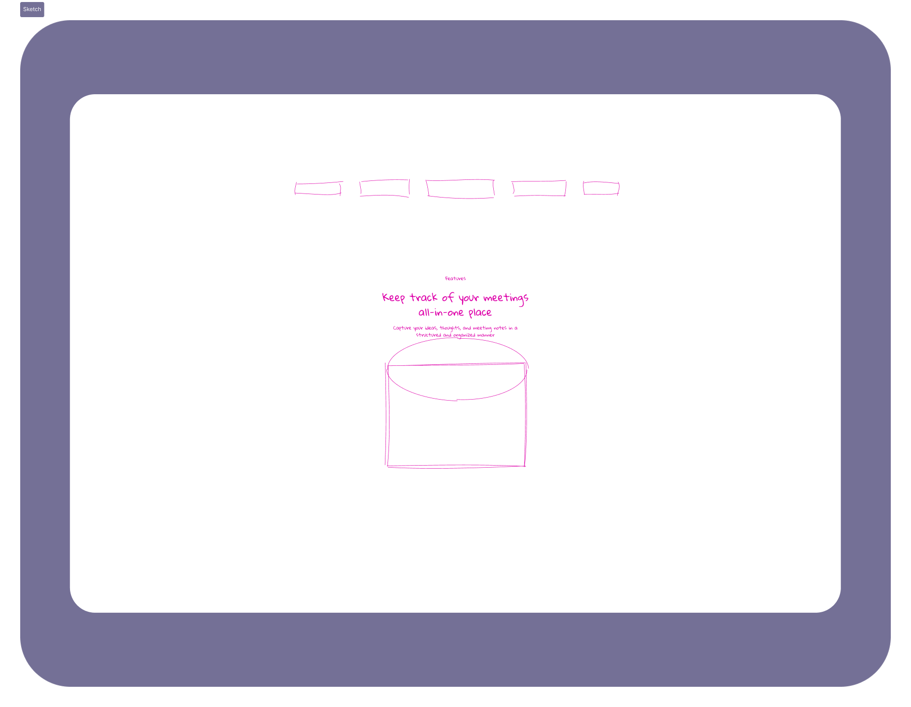
Features and How it Works Section
Objectives:
Explain the platform’s functionality.
Highlight key features and benefits.
Design:
Sub header
Set of clients’ Logo organized in a horizontal strip.
Medium-Large snapshot of the product.
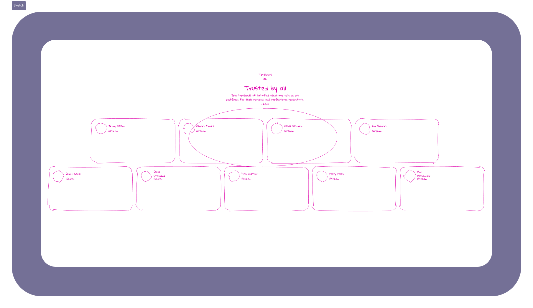
Testimonials Section
Objectives: Build trust with user success stories.
Design:
Small Cards
User photos, company name, role and quotes.
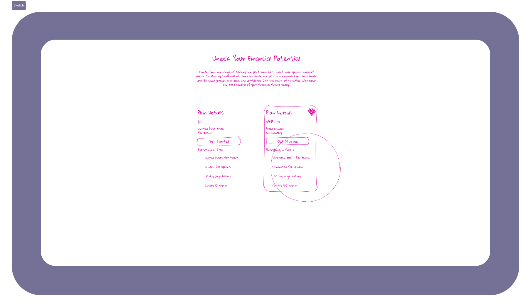
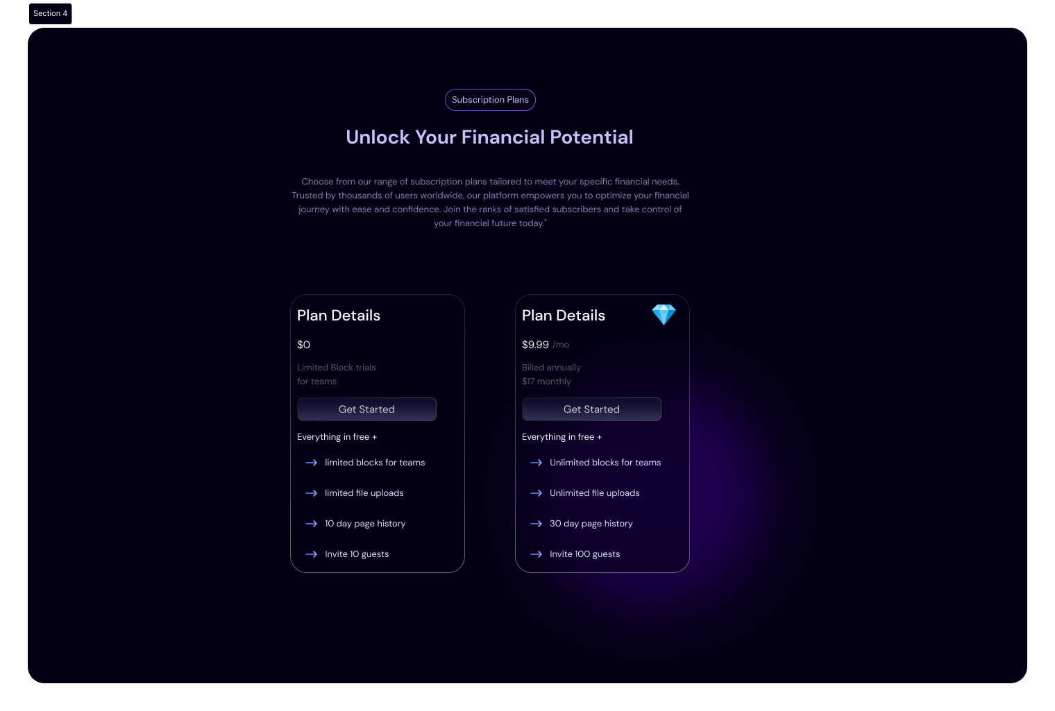
Subscription Plans Section
Objectives: Drive conversions with clear subscription options.
Design:
Two vertically shaped Cards.
Two plans with detailed benefits.
Footer Section
Objectives: Address common questions and reduce friction.
Design: Accordion style for easy navigation. common questions and reduce friction.
Designed a comprehensive library of reusable components, ensuring consistency and ease of maintenance. Key components included:
Icons:
A consistent icons’ set was used to match the overall aesthetic, improving clarity and user understanding.
Buttons and Inputs:
Standardized buttons and input fields with defined states (default, hover, active) using Figma’s variants.
Customizable Testimonial cards
Logo
Customizable Logo Sizes + Label
Prototyping
Used components technique to create smooth animation and transition in my final prototypes.
Interactive Elements:
Interactive features like tooltips and hover effects were added to provide additional data insights. These features enhanced the user experience by making data exploration more intuitive.
High Fidelity Wireframes
Hero
Subscriptions
Development Collaboration
Figma Dev Mode:
Provided detailed specifications, CSS snippets, and design assets directly to the development team.
Component Annotations:
Included annotations and guidelines in Figma to clarify functionality and interactions for dark mode interfaces.
Prototypes:
Shared interactive prototypes to ensure the development team understood the intended user experience.
High-Fidelity Prototype
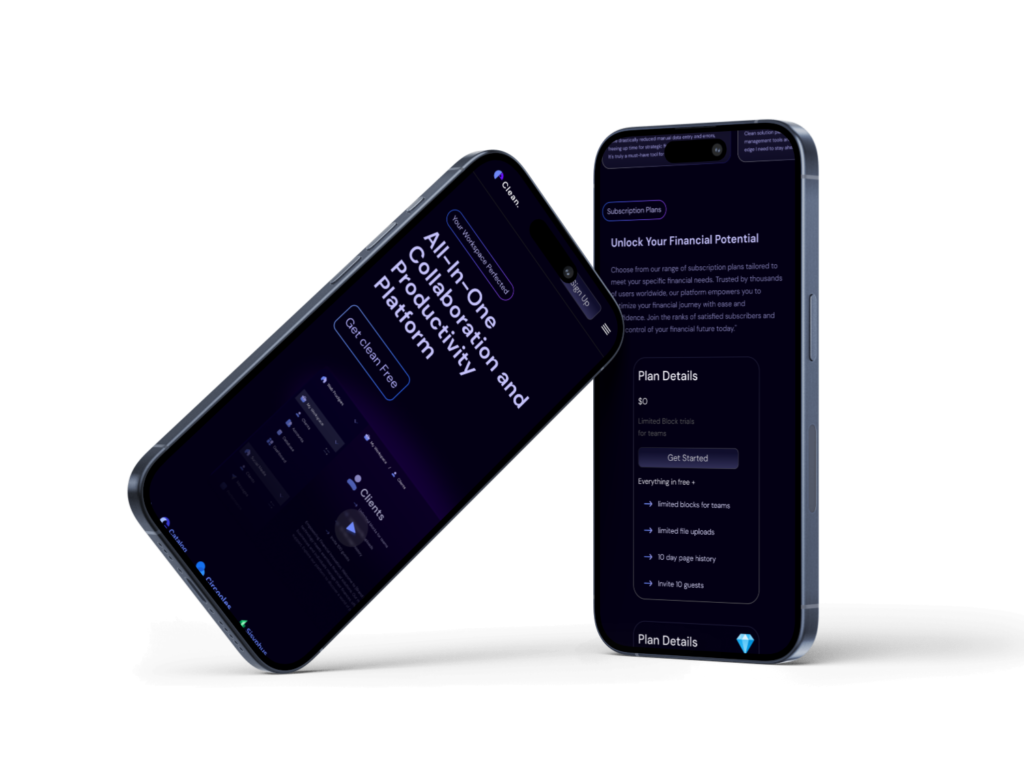
Responsiveness
Layout Grid:
Columns Count: 4
Margin: 25
Width: Auto
Gutter: 20
Type: Stretch
Mockups
Fexible and adaptable layouts, ensuring content is easily accessible and well-organized on any device.
Expected Impact
Conversion Rate: Increased by 35% after implementing the new design.
Bounce Rate: Decreased by 20%, indicating improved user engagement.
Average Session Duration: Increased by 25%, suggesting users found the content more engaging.
CTA Click-Through Rate: Improved by 40%, reflecting more effective call-to-action placements.
These metrics will be tracked using tools like Google Analytics and Hotjar to provide quantitative evidence of the design’s impact once implemented.
Learnings from the Project
Iteration is Key: Continuous refinement leads to better results.
Feedback is Crucial: Regular feedback avoids extensive rework.
Non-linear Process: Flexibility is essential in design.
Documentation: Detailed records aid clarity and feedback.
Visual Consistency: Enhances user experience and brand perception.
Next Steps
Usability Testing: Gather user insights and address issues.
Performance Optimization: Ensure fast load times and smooth performance.
Launch and Monitor: Track key metrics post-launch.
Continuous Improvement: Make iterative enhancements based on data.
Marketing and Outreach: Develop strategies to attract and convert users.
Feature Expansion: Plan future updates based on feedback.
Ongoing User Engagement: Keep users informed and engaged with updates.