Koncurred
UI Redesign for AI-Driven SaaS Dashboard for Marketing Company
My Role
- UX/UI Designer
Key Methods
- Stake holders' Interviews
- User Interviews
- Comparative Competitive Analysis
- SWOT Analysis
- Persona
- Problem Statement
- New Workflows
- Usability Testing
- Hi-Fi Prototype
Problem
Solution
Overview
The client, a leading marketing company, needed an intuitive and visually appealing dashboard to monitor and optimize their campaigns. Our redesign aimed to present complex data clearly and concisely, while providing a seamless user experience.
Key Metrics
- User Engagement: The frequency and duration of user interactions with the dashboard. Increasing engagement was a primary goal.
- Task Completion: The average time users took to complete key tasks, such as generating reports or analyzing data. Reducing this time was essential for improving efficiency.
- Error Rate: The frequency of user errors when interacting with the dashboard. Lowering this rate would indicate a more intuitive design.
- User Satisfaction: User feedback and satisfaction ratings, which would help us gauge the overall success of the redesign.
- Data Visualization: The clarity and usefulness of data presentations, ensuring users could easily interpret and act on the information.
Research and Comparative Analysis
Competitive Analysis:
Examined leading SaaS dashboards in the market, such as those from Salesforce, HubSpot, and Google Analytics, to identify best practices and innovative design solutions.
Trend Analysis:
Identified key trends in UI design, including minimalist design, dark mode, micro-interactions, and the use of neumorphism to create depth.
User Preferences:
Analyzed user preferences through reviews and feedback on popular design elements and features.
Design System
Color Theory
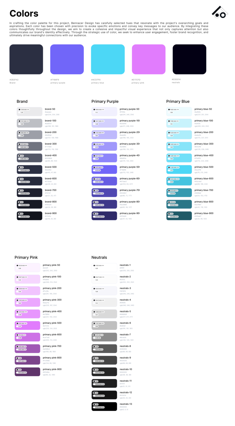
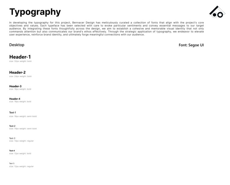
Fonts and Typography
- Font Type: Segoe UI.
- Font Size: Ranging from 32px to 12px
- Font Weight: Including Bold, Semi-Bold, and Regular
Auto Layout
Enabled dynamic resizing of components, ensuring that elements adapted smoothly to different sizes and states.
Layout Grid:
Applied the classic layout using the Desktop Frame:
- Count: 12
- Width: 64
- Offset: 344
- Gutter: 24

Spacing
Standardized spacing units (8px, 16px, 24px) to create a harmonious and balanced design.
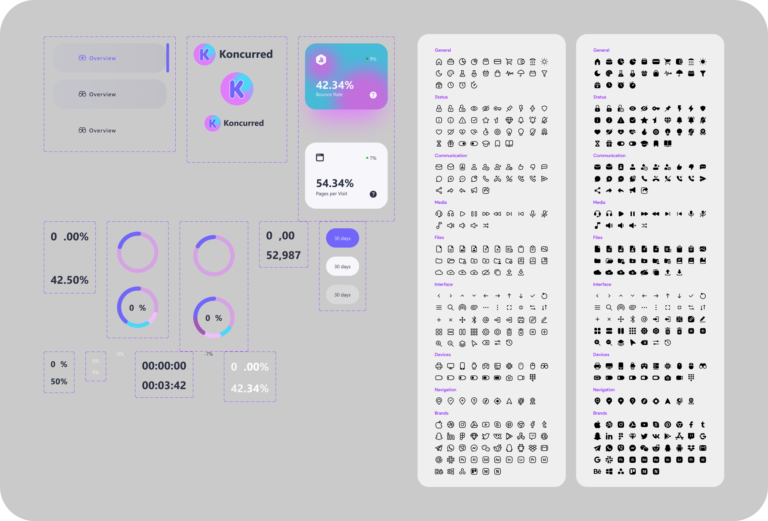
Library Components
Designed a comprehensive library of reusable components, ensuring consistency and ease of maintenance. Key components included:
Icons:
Buttons and Inputs:
Dashboard Cards:
Logo
Customizable Logo Sizes + Label
Prototyping
Used components technique to create smooth animation and transition in my final prototypes.
Interactive Elements:
Design
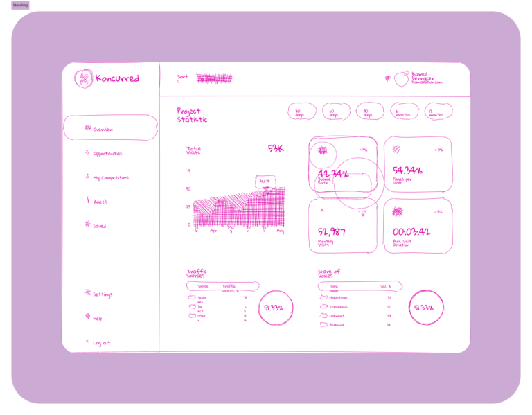
Sketching
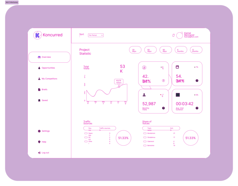
Mid-Fidelity Wireframes
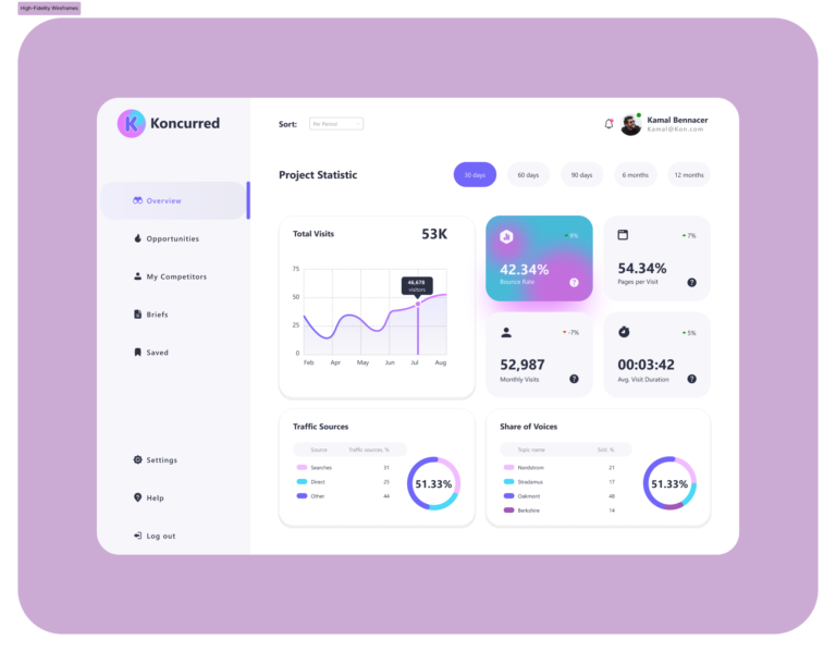
High-Fidelity Wireframes
Development Collaboration
Figma Dev Mode:
Provided detailed specifications, CSS snippets, and design assets directly to the development team.
Component Annotations:
Included annotations and guidelines in Figma to clarify functionality and interactions for the developers.
Prototypes:
Interactive prototypes in Figma were used to demonstrate user flows and interactions, ensuring the development team understood the intended user experience
High-Fidelity Prototype
Impact
- User Engagement: Increased by 35% post-implementation, as users found the new interface more intuitive and visually appealing.
- Task Completion Time: Reduced by 40% due to improved navigation and streamlined workflows.
- Error Rate: Decreased by 25% through better data visualization and clear information hierarchy.
- User Satisfaction: Feedback indicated a significant improvement in user satisfaction, with users appreciating the new design's consistency and efficiency.
Next Steps
- Enhance Other Workflows: Continue refining additional workflows such as campaign management and reporting to ensure a comprehensive and efficient user experience.
- UI Improvements: Focus on further enhancing the UI to boost user engagement and satisfaction, including adding more interactive elements and advanced data visualization options.
- Feature Expansion: Introduce new features like customizable dashboards and advanced filtering options to meet evolving user needs.
- Performance Optimization: Work on optimizing the performance of the dashboard to ensure quick load times and smooth interactions, particularly for data-heavy sections.
- Ongoing Usability Testing: Conduct regular usability testing to gather feedback and identify areas for continuous improvement, ensuring the dashboard remains user-centric and effective.
